Practo's five product teams were building five different apps inside one. The app served 4 million users across five countries, but growth had flatlined. Features were invisible, flows were disconnected, and the org structure was the root cause. I led a 16-month effort to unify the product, the design language, and the team around a single connected healthcare system.
The system problem
Practo's business had scaled fast, launching doctor search, appointments, pharmacy, health records, and insurance as separate verticals. Each had its own product team, its own design team, and its own roadmap. The result was an app that felt like five apps duct-taped together.
Users experienced this as confusion. Drop-offs were high across every funnel. Adoption of secondary features was near zero. Marketing campaigns brought users in, but the product couldn't retain them.
Working with the customer satisfaction team and analyzing behavioral data across 4 million users, I identified four structural failures, each rooted in the org, not the interface:
Misunderstood user archetypes
3-level deep architecture buried features
Zero personalization in a deeply personal domain
17 shades of brand blue, no shared design language
Reframing the problem
The initial brief was to "redesign the app." I pushed back. The app was a symptom. The actual problem was organizational: five teams building without shared infrastructure, principles, or understanding of the user.
I established a research program and segmented the user base by engagement, transaction recurrence, and lifetime value. The data revealed three distinct user archetypes with fundamentally different needs, replacing the single "Practo user" the org had been designing for.
The architecture bet
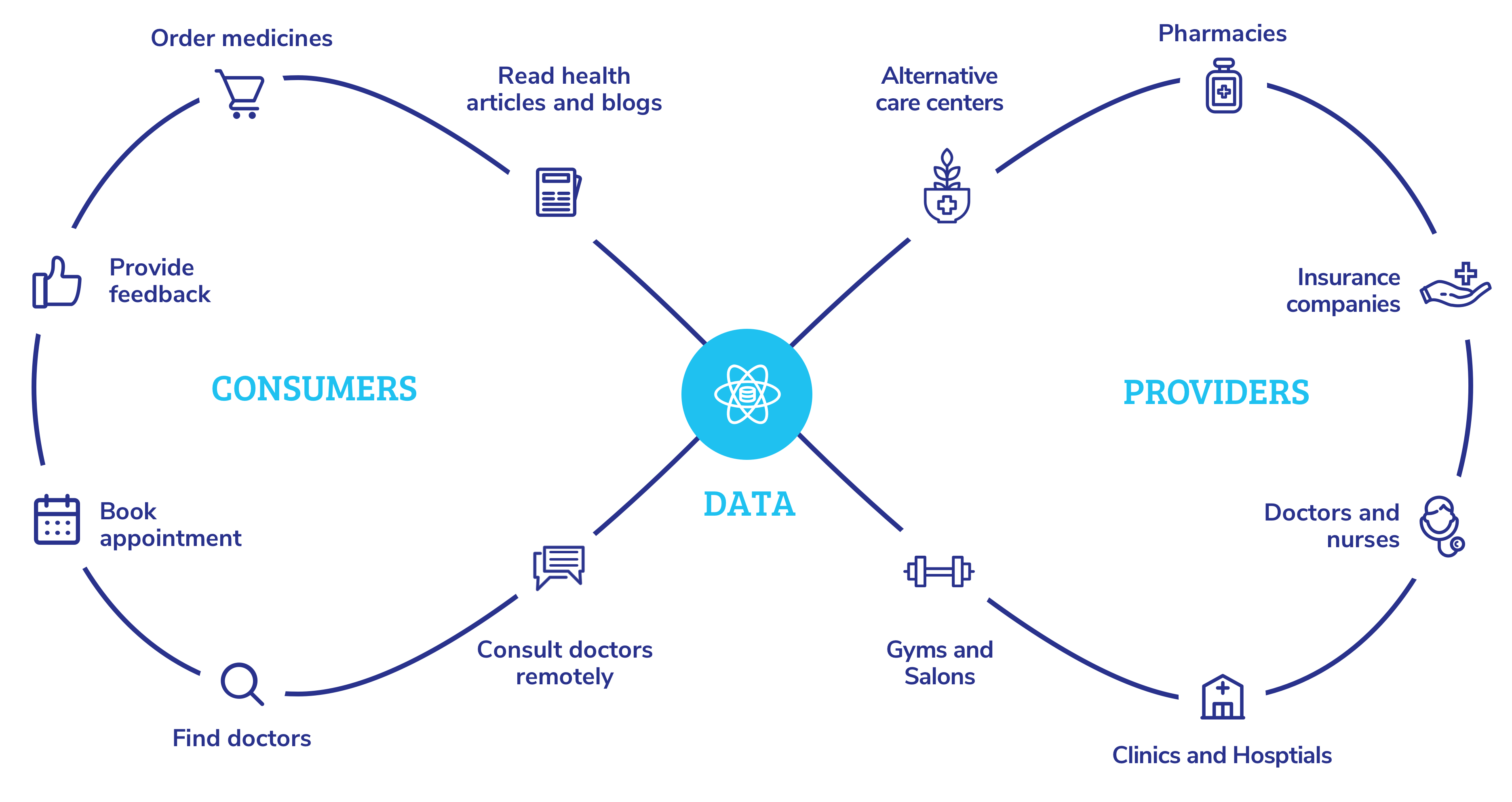
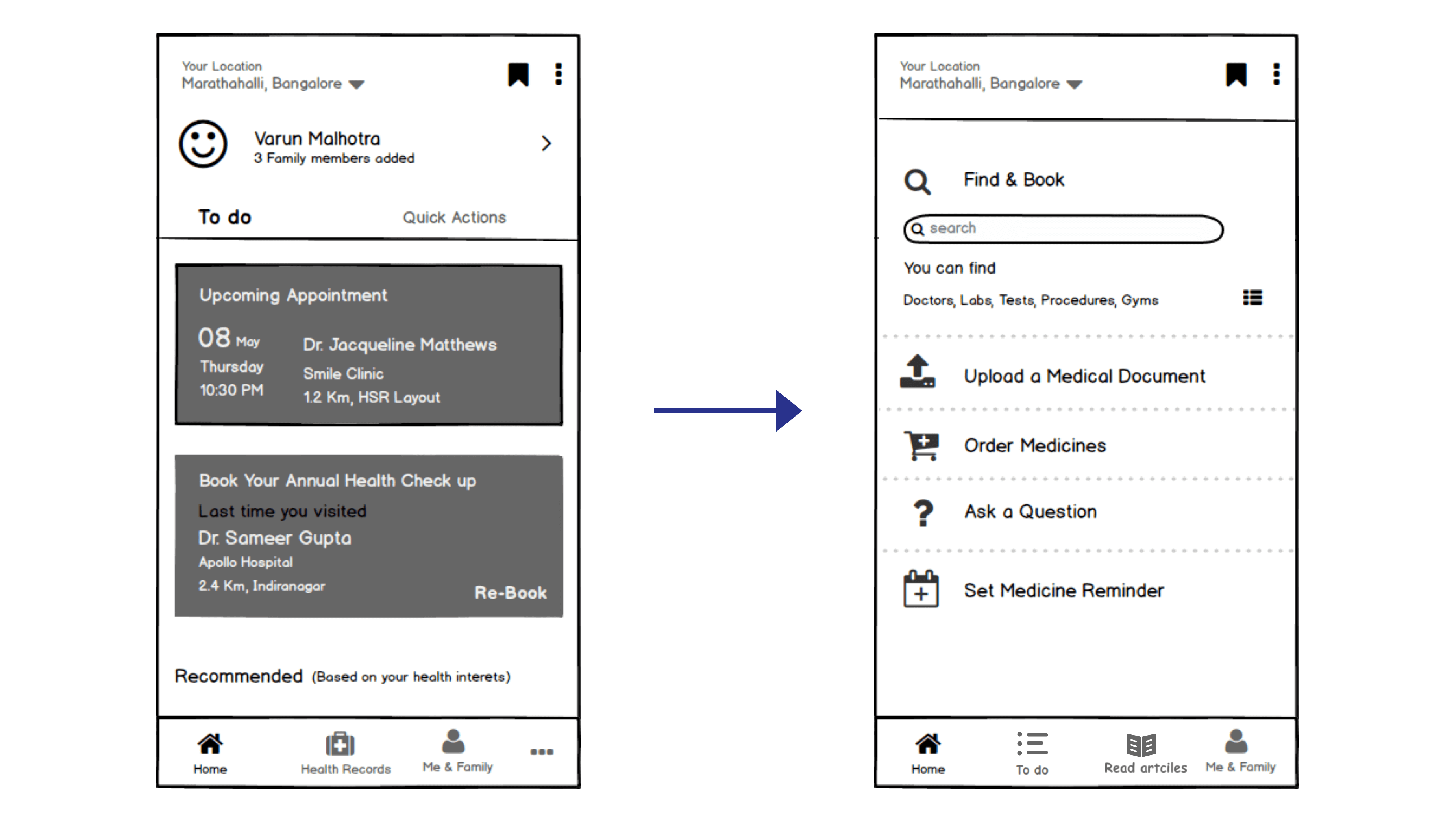
The app used a linear architecture: search, select, book, done. Actions in one vertical never carried over to another. I proposed a circular architecture mirroring how healthcare actually works: consult, get a prescription, order medication, set reminders, book a follow-up. Each step anticipates the next.
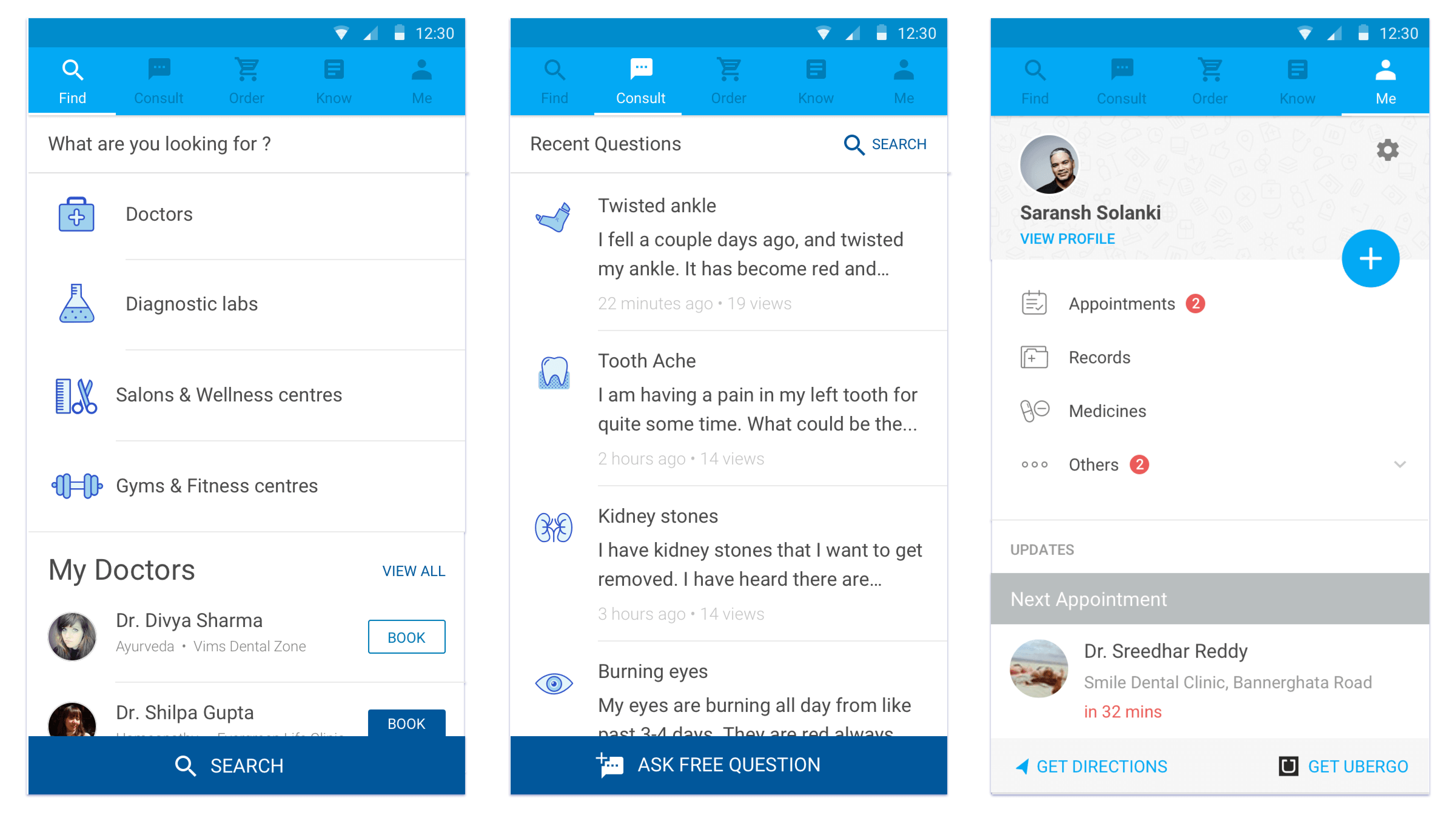
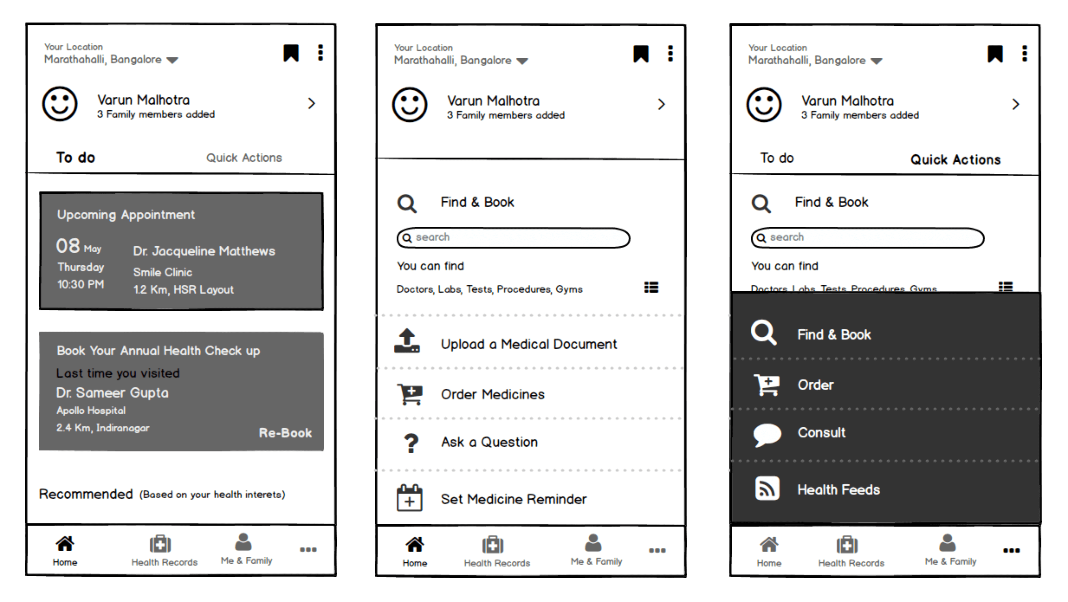
I tested three structural iterations through usability studies and card-sorting. Iteration #1 performed best: users strongly gravitated toward the "to-do" pattern that surfaced personalized next actions.
Navigating the constraint
The ideal architecture, combining to-do and quick actions on a single screen, would add 5-6 months to the engineering timeline. This was the hardest decision in the project. I worked with Product and Engineering leadership to design a compromise that preserved the circular model while fitting within the existing technical infrastructure.
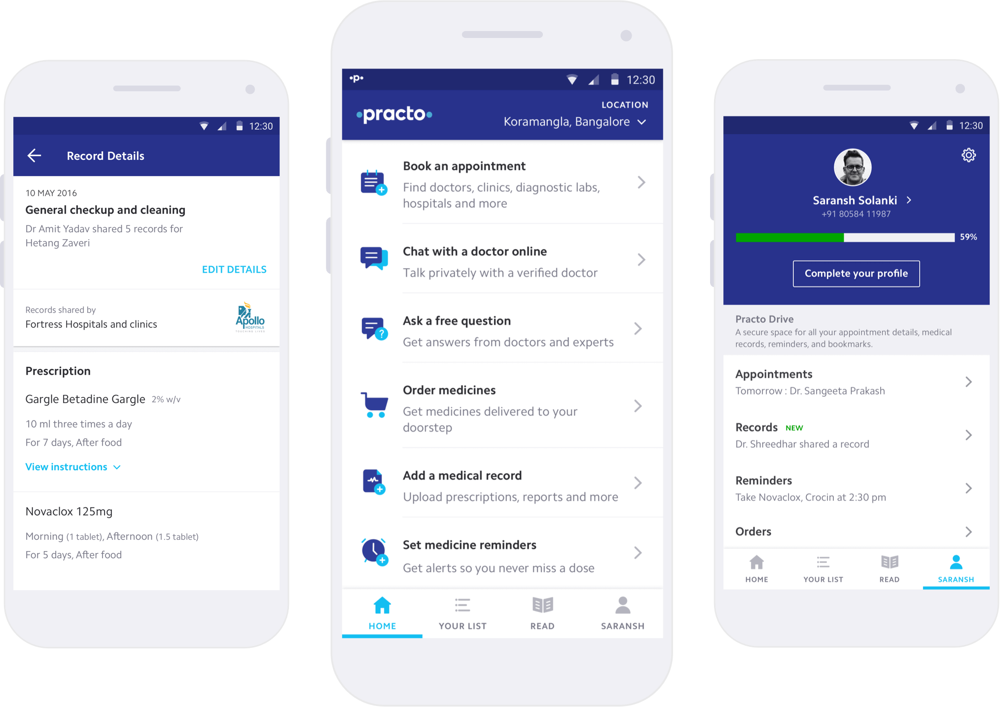
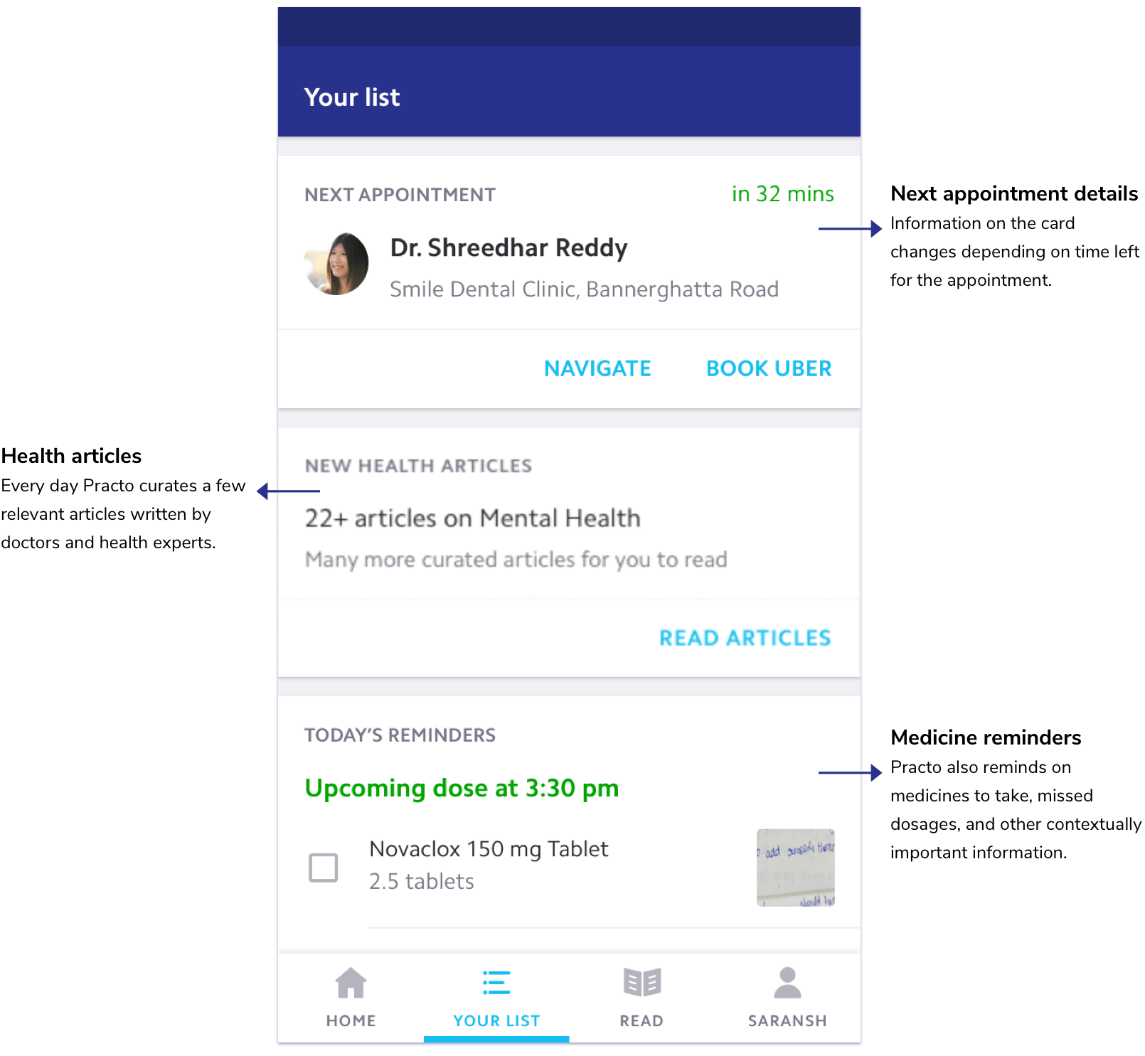
Your List, the intelligence layer
"Your List" became the brain of the application. Using anticipatory design, it surfaces contextual prompts based on user history and health data, reducing decision fatigue while guiding users through their health journey. It doesn't make decisions for users; it minimizes superfluous interactions and lets them get on with their day.
Building the org capability
A unified product requires a unified org. The architecture work exposed a deeper need: Practo had no shared definition of quality, no shared components, and no shared principles guiding product decisions. I initiated two parallel workstreams to fix this.
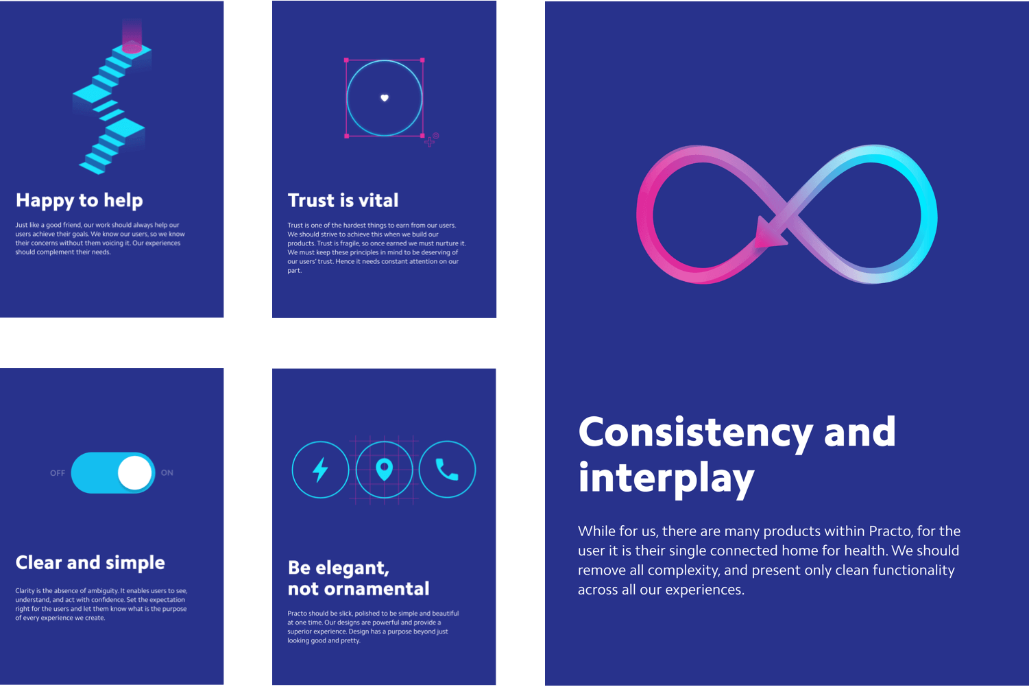
Design principles and system
I formed a cross-functional working group to define what design excellence meant at Practo. The result was a set of design principles that became the decision-making framework across all five business units and 4,000 employees.
Design principles ↗
I then audited every screen in the app and built a comprehensive design system, standardizing components, colors, icons, and interaction patterns. The 220-icon library and component system were adopted across the entire organization. The technology team adopted compressed components, reducing the app download size by 63%.
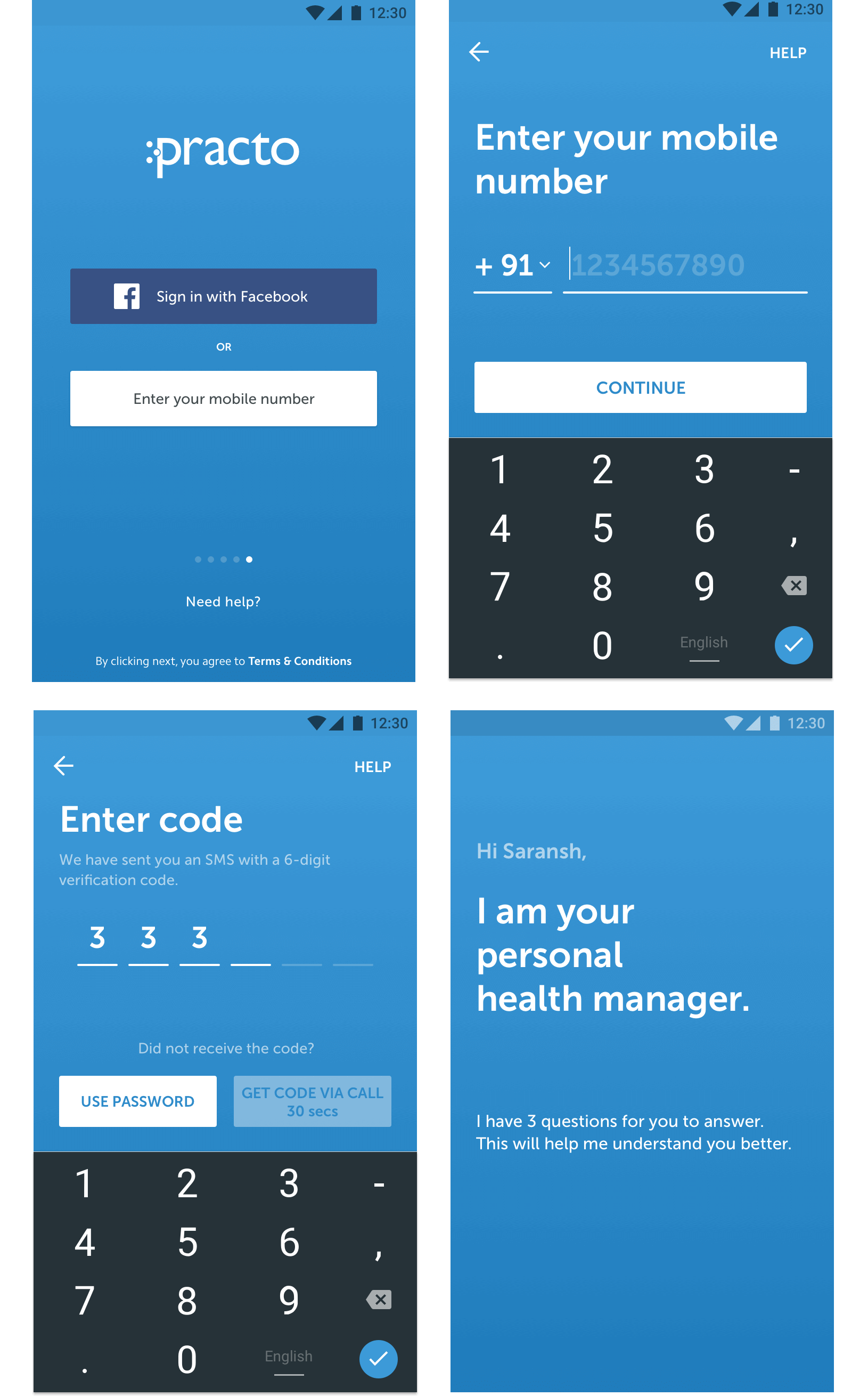
First-time experience as a data strategy
The onboarding flow wasn't just a UX problem. It was a data problem. Users didn't know what Practo offered, and Practo didn't know what users needed. I combined login and onboarding into a single flow: OTP-based authentication followed by three questions that identify the user's archetype and adapt the app structure.
What shipped
The final stage was a visual brand revamp in collaboration with Chermayeff, Geismar & Haviv . Every visual touchpoint was redesigned to reduce ambiguity and reinforce the unified system.
Read article ↗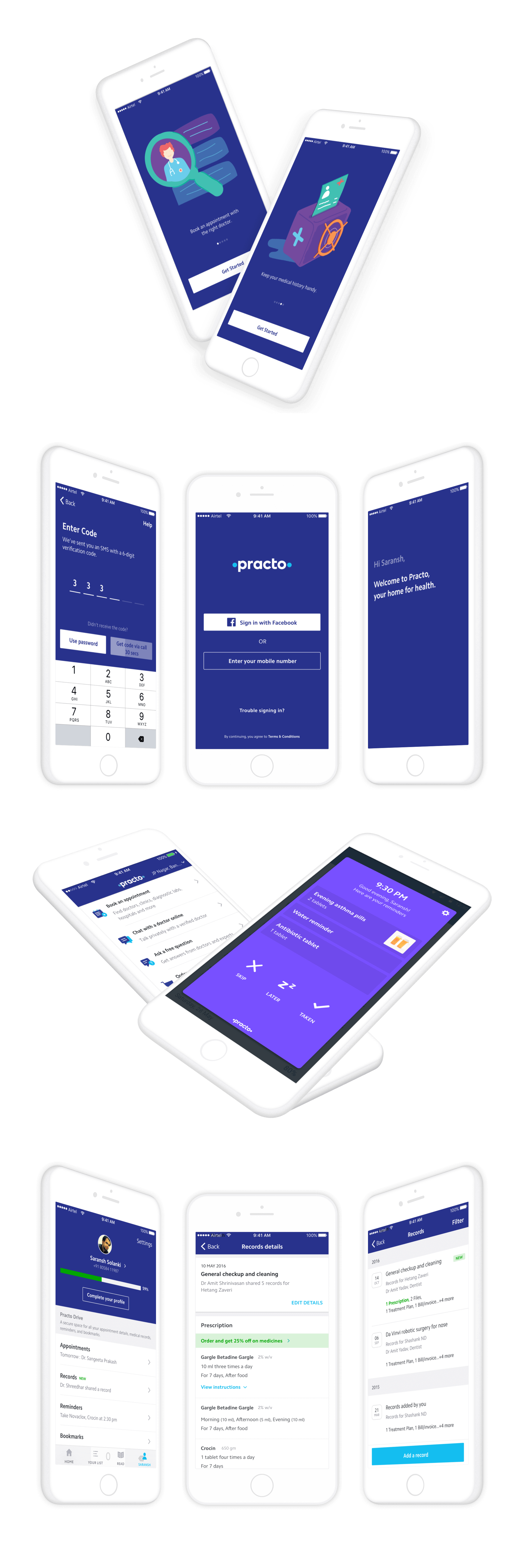
What changed
Beyond metrics: user engagement, retention, and active user counts all increased. A new Core Team was formed to own the architecture, onboarding, and system-level product decisions, a permanent org change that outlasted the project.